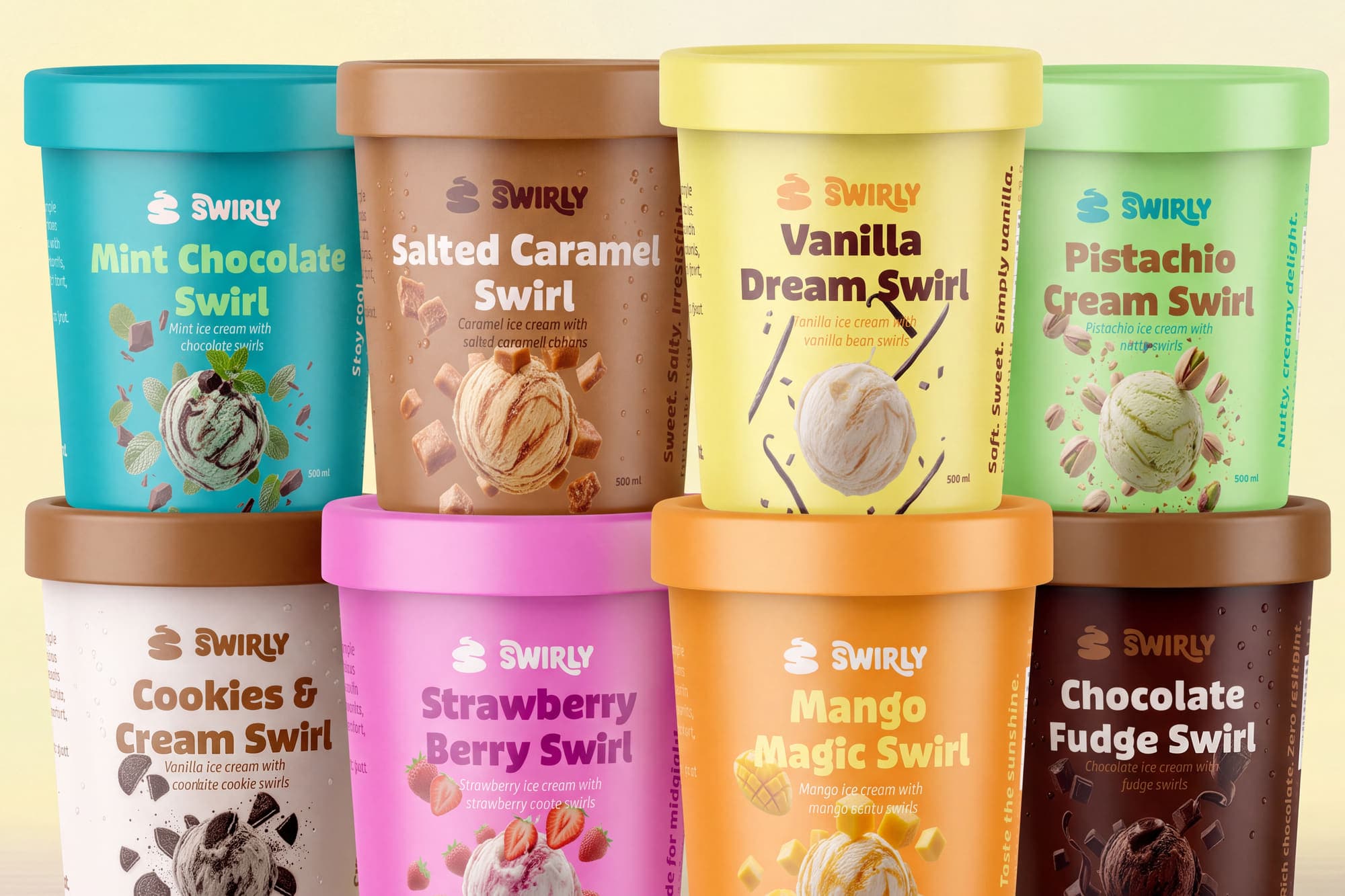
A full brand world
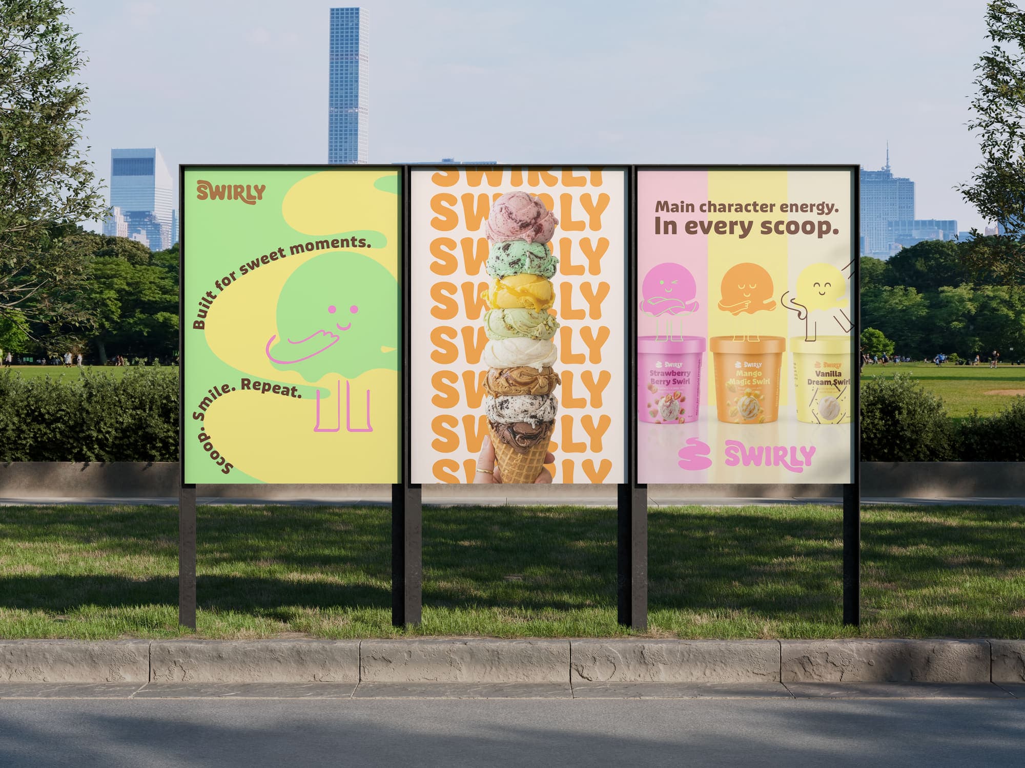
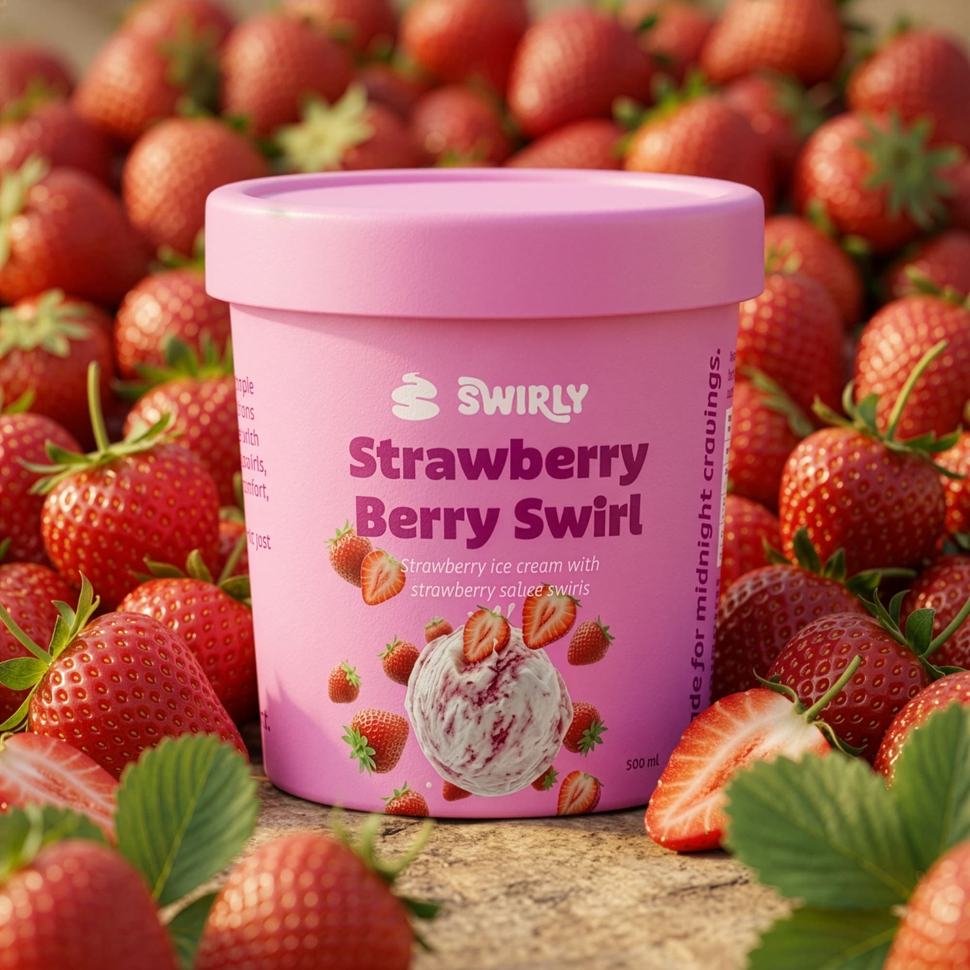
This project explores a full brand world, from positioning and visual identity to packaging across multiple flavours, colour systems, and expressive brand touchpoints. Every element is designed to feel cohesive yet full of personality.
At its core, Swirly is about contrast, bold yet soft, nostalgic yet modern, simple yet expressive. The system leans into vibrant colours, fluid forms, and a tone of voice that feels light, confident, and full of joy. Nothing feels forced. Everything flows.
Designed to feel like a swirl
The identity system is built around the idea of movement, layering, and contrast, much like the product itself. Soft, fluid forms and rounded typography echo the visual language of swirls, while a bold colour system assigns a distinct personality to each flavour.
The design balances playfulness with structure. Bright, expressive colours are grounded by clean layouts and consistent hierarchy, ensuring the system feels cohesive across packaging and touchpoints. The result is a brand that feels light, modern, and instantly recognisable, without relying on overused cues from the category.
A brand that stays with you
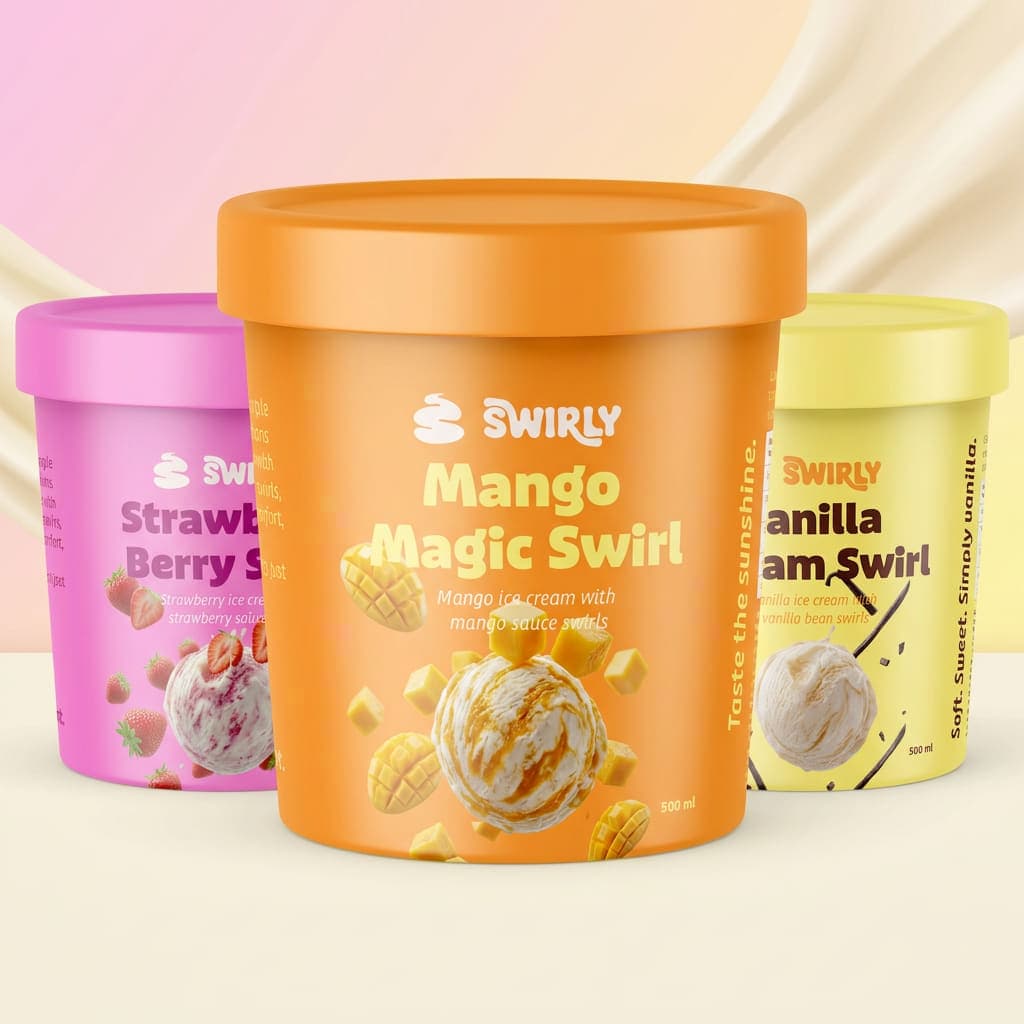
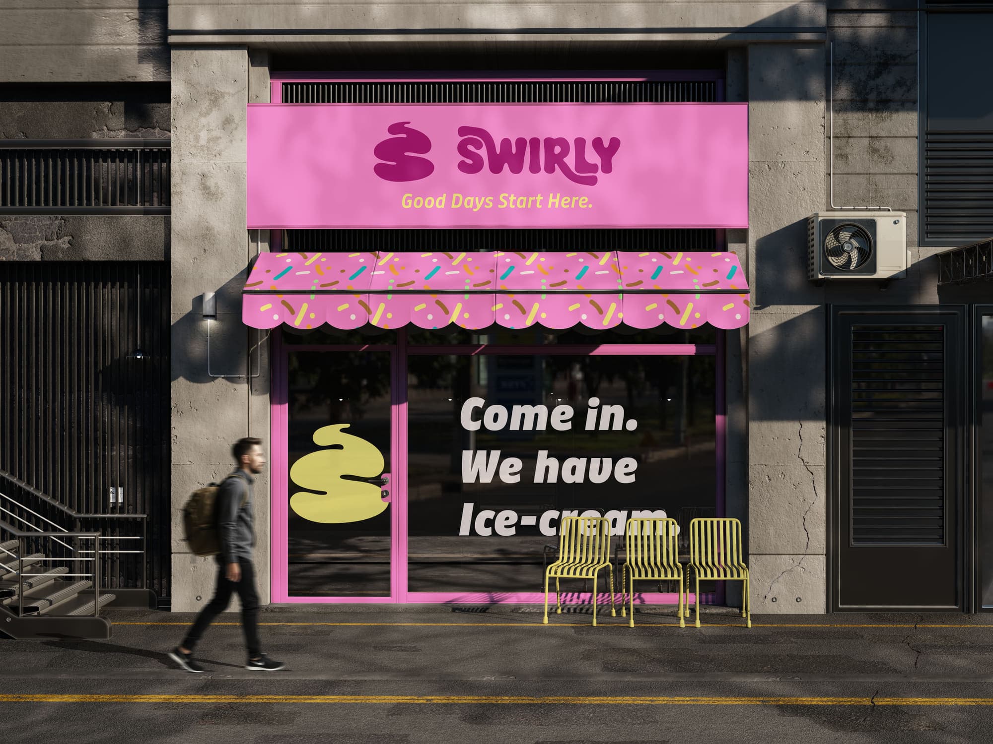
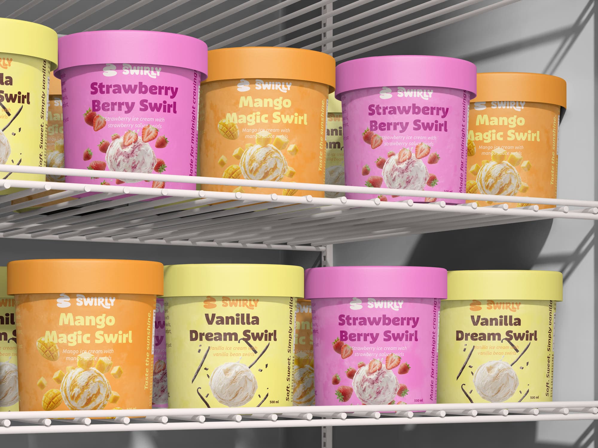
Swirly is designed to be more than just a product on the shelf. It’s a brand that invites interaction, emotion, and recall. From its distinctive colour system to its fluid visual language, every touchpoint works together to create a cohesive and memorable experience.
The result is a brand that feels both familiar and fresh, one that stands out without trying too hard, and leaves a lasting impression long after the last scoop.